Cities can use dashboards to make better decisions about early childhood
At a time when more of the world’s children are growing up in cities than ever before, the Bernard van Leer Foundation is working with city governments around the world to find new and scalable ways to make cities child-friendly as part of its Urban95 programme.
One of the tools used by cities as they collect more data is a “dashboard”: a tool for collating and sharing data in an accessible format. A dashboard can be used to draw attention to a need for change, assess progress, promote learning and accountability, and communicate information.
Making better policy decisions
BvLF asked the Open Data Institute (ODI) to explore how data dashboards could help guide city leaders and their teams to make better policy decisions about early childhood development. Our team – Fiona Smith, Jessica Weereratne, Oliver Rice and I – interviewed academics, practitioners and data experts from around the world working in early childhood development and city government. We will publish our findings in early November, including detailed recommendations for cities building dashboards. In the meantime, this blog summarises six broad lessons from our research.
Overall, we found many benefits that can come from cities using dashboards to strengthen child-friendly policies. Dashboards can help to focus an organisation’s attention on a small number of key goals. They can help cities to prioritise, encourage collaboration, strengthen the voices of children, and inform investment and planning decisions. When a dashboard is published openly, it can also promote transparency and accountability.
Six lessons for creating an effective dashboard
A city needs a clear data strategy before it builds a dashboard. That means knowing what the dashboard is for: for example, is it designed to motivate teams to work together, track progress towards a goal, keep citizens informed, or a combination of these? It is important for the city to analyse what data is already being collected, and who will be seeing or using the dashboard, to decide which indicators to display and who should see the dashboard.
The process a city uses to decide the purpose and indicators for a dashboard is important. It can help to bring groups together, surface differences in approach and find common goals. It can also reveal important gaps in data collection and systems. In New Zealand, for example, the Better Public Services dashboard helped to focus efforts across government towards progress on a carefully selected small group of indicators. To support this benefit, it is useful for a city to involve teams and decision-makers across the organisation – and sometimes outside the organisation – to ensure a dashboard is designed well.
A dashboard needs to work for the data literacy of its users. Especially if a dashboard will be open to the public, it should be designed in a very clear and intuitive way. At Brazil’s Igarapé Institute, the team uses a ‘ten second rule’ to test whether they have successfully presented large volumes of data in a way that helps policymakers to understand quickly, and be able to use that understanding to act thoughtfully. For a team to get the best from a dashboard they use, they need to understand what the data is representing and how their day-to-day actions might cause changes in indicators. This works best where there is a culture of learning within the team, using changes in a dashboard’s indicators to work out what is working well, or which parts of a city might need a new approach.

Effective dashboards are underpinned by strong leadership. As well as Investing in their team’s data literacy, leaders should encourage maintenance and use of the dashboard within the city’s existing strategy and to promote learning. This makes it easier to integrate dashboards into existing work structures, which makes them more likely to be updated, noticed and acted upon.
Measures such as proxy indicators to approximate impact can help overcome data collection barriers. Cities often find it difficult to find the right data to measure a desired impact; in general, drawing on existing data is key to creating an effective urban dashboard. In Istanbul, Professor Guvenc and his team at Kadir Has University could not find data about household income, so used real estate valuations as a proxy indicator to help identify areas most in need of child welfare services.
Data about young children needs to be securely managed, as it is often private or very sensitive. Data about individual children might be brought together to help care workers make better decisions, but if it is converted into a dashboard that will be shared more widely, it needs to be encrypted, anonymised and often aggregated.
Dashboards in action
Around the world, governments are seeing the impacts of well-designed dashboards. In New Zealand, as part of the Better Public Services initiative, ten priorities were chosen across government in 2012 after a lengthy consultation process, and tracked in a public dashboard. There have been significant improvements in every indicator since, and a study of the initiative has shown that a key benefit was improved trust between teams.
An illegal dumping data platform, a simple initiative by Open Data Kosovo and the Deputy Mayor of Gjakova, involved volunteers collecting, mapping and publishing data about the location of illegal waste disposal. They found 686 illegal dumping sites, resulting in over 75% of sites being cleaned up by the city of Gjakova.
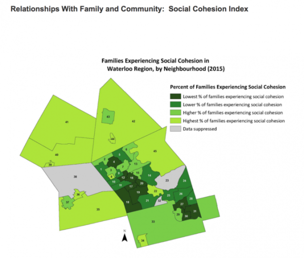
In Ontario, Canada, the Child Wellbeing Dashboard for the Waterloo region is being used to help build new early childcare centres where they are needed most. The dashboard shows where programmes and services for children already exist, and where they are situated in relation to other services, such as libraries. While examples like these are growing, use of data by cities to help them become more child-friendly is still at its early stages. We hope our report will help other cities monitor being great places to raise healthy, happy children.
Courtesy of the Bernard van Leer Foundation.